The first step with my creative project has been working out how I want the website to look. I’d like to add a Spotify player directly onto the website rather than having the links as they are now. I’d also like to change the background to the cover of the EP that I’m working with for the visual aspect. As the weather starts to improve I’ve been able to start thinking about what locations I want to use for the visual component. The idea is to have three different locations for each of the three songs. So far I’ve thought about using a car for the first song, a forest for the second, and a beach for the third. The thought process with this is that the car is symbolizing starting a journey, we’ll be going somewhere but we’ve got no idea where that place is. The second location being a forest is meant to represent the lack of security that comes with a journey, you can get lost in it, but you can find peace and clarity, too. The final location being a beach is meant to represent the open space, the possibilities that come with embracing your own path. Mixed in between these pieces will be some sort of dialogue or spoken word, reflecting or introducing these concepts.
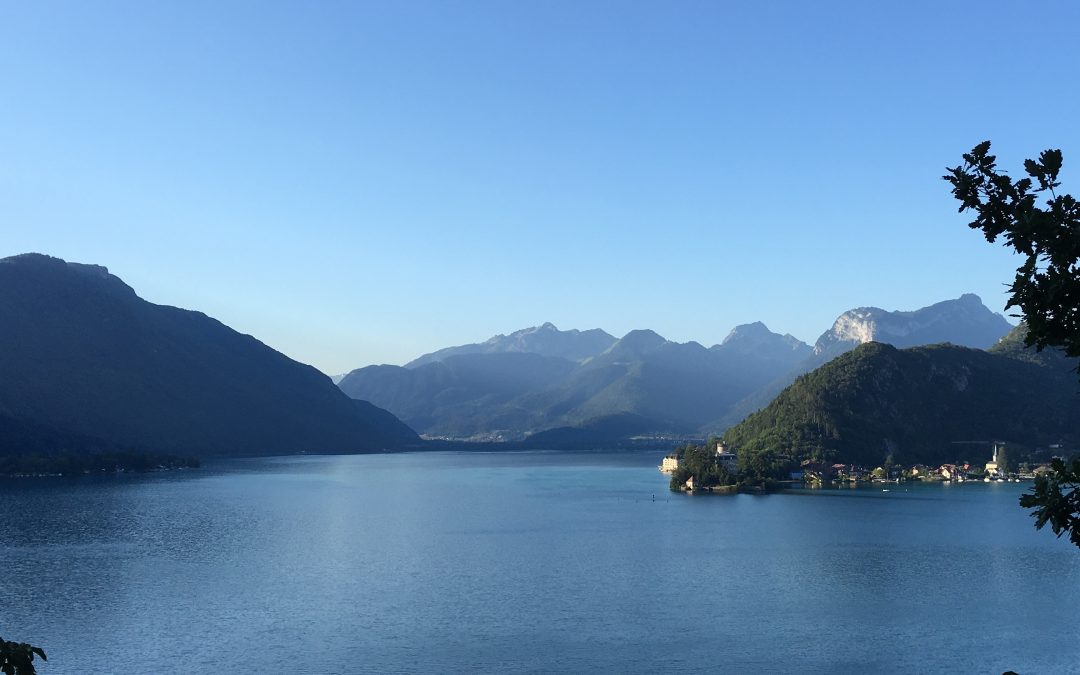
The picture above is the cover of the EP. I’ll be using photos I’ve taken over the years to build the aesthetic of the site.

